

It's time to finally close the book on HorrorLand once and for all. We ranked the books by their overall grades, so there's only one last piece to this puzzle, and that's to rank all of the cover artwork by Brandon Dorman. Only this time we'll be adding the one book I didn't cover, Welcome To HorrorLand: A Survial Guide. Unfortunately, unlike most of Tim's art, full pieces of Dorman's art isn't available to use, but the covers still give us a gist of what his intentions were. So, without further ado.
#20: REVENGE OF THE LIVING DUMMY (01)

Consensus: Cover is way too busy for its own good. I get it has to sell both HorrorLand and Slappy, but it ends up just not clicking for me as well as it should. Add in the fact that Dorman's Slappy just isn't that good and you can see the issue.

There is an alternate piece of artwork, I don't know if it was exactly for this book, but it does fit the plot a lot better and has better imagery (not so much creepy face tree, but the cemetery background is a lot cooler).
#19: DR. MANIAC VS. ROBBY SCHWARTZ (05)

Consensus: I just don't care for Dr. Maniac's design overall, feeling like if you just put Buddy from Camp Jellyjam in a supervillain costume. I do like the pseudo-3D feel of the cover with him breaking free from the screen, but it's still not enough to wow me.
#18: LITTLE SHOP OF HAMSTERS (14)

Consensus: Point to Dorman for trying his best, but you just can't make hamsters scary. This comes close, as these ones look freakier than Cuddles, but it's still hamsters. I do like the color and the semi-warped feel of everything.
#17: THE SCREAM OF THE HAUNTED MASK (04)

Consensus: So like Dorman's Slappy, I'm not too crazy for his Haunted Mask either. It gets some things right, but just feels off. Maybe it's the pointy ears. Regardless, I do like the juxtaposition between the Haunted Mask and the cuter masks in the window display, which somehow are just as creepy.
#16: ESCAPE FROM HORRORLAND (11)

Consensus: Now, unlike Slappy and the mask, I do like Dorman's Horrors. How they all feel consistent and do have a creepy ogre-beast vibe to them. And that works well with Byron. My problem is that I think it's not the art, but the fact that I feel my biggest issue with HorrorLand is just how little the actual horrors mattered to the plot. And Byron is the best example of that. A character built up throughout the story, just to be a lackey. Kinda lame, Jovial Bob.
#15: SLAPPY NEW YEAR! (18)

Consensus: Still not too fond of this Slappy (might be the cheekbones), but I do like the juxtaposition of this freaky creep in front of a fun, festive New Year's party. It's better than the first Slappy cover for HorrorLand, but not by much.
#14: SAY CHEESE - AND DIE SCREAMING (08)
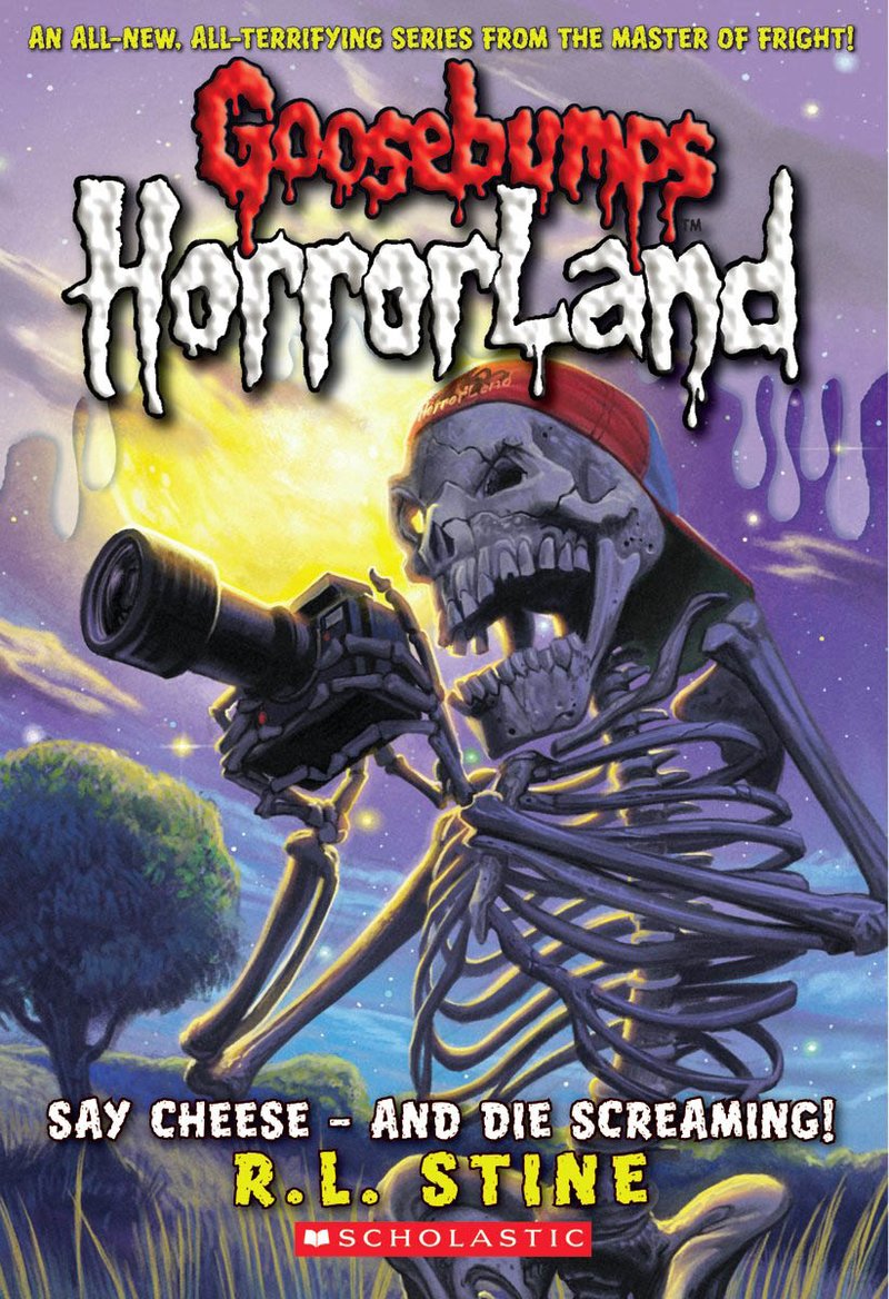
Consensus: This cover is freaky, but lacks the punch that the original Say Cheese and Die covers did. I will say I like it more than Say Cheese and Die - Again's cover. Some good colors and I like the cracks in the skull of the skeleton. I just really really don't get why the skeleton is naked though. I think that takes away from what made the originals feel so freaky. Regardless, it's solid.
#13: CREEP FROM THE DEEP (2)

Consensus: Deep Trouble covers have consistently been some of the best and while I don't think this is as good as the original, it is better than Deep Trouble II. Great design on the eel, who feels like a threat with how it breaks the window. Too bad this doesn't happen in the story, merely via dream sequence, which downgrades it a bit.
#12: HELP! WE HAVE STRANGE POWERS! (10)

Consensus: I like the detail on Madame Doom, and I'm a sucker for checkerboard designs. I do kinda wish there was a bit more to it. Like it's zoomed in so close that it's missing something to really make it stand out.
#11: WELCOME TO CAMP SLITHER (09)

Consensus: I like that this cover doesn't really reveal much about the story itself, but gives you enough to go by. You know there's snakes, a camp, and some ominous buildings on a hill. The snakes are well detailed and I really like the colors of the cover presenting a bright orange sky.
#10: HEADS, YOU LOSE! (15)

Consensus: There are things I like about this cover. The warping, the colors, and the design of the headless Prince Warwick, leaping at the reader in a rage. Or maybe he wants to tickle you. Kinda hard to tell given the lack of a head. Of all the headless ghost covers we've gotten, this is easily the best of the bunch.
#09: WHO'S YOUR MUMMY? (06)

Consensus: Dorman's mummies are also something I generally like as he makes them more disheveled and freaky. And while I prefer the mummy design in his take on The Curse of the Mummy's Tomb, this is still a creepy sight.
#08: WELCOME TO HORRORLAND: A SURVIVAL GUIDE

Consensus: I finally get to cover this... cover. And it's another decent one. I like the design of the roller coaster and the track, and we get another creepy looking horror. We get Slappy, because heaven help us if we didn't have Slappy on a cover, but he looks fine as well. He does look a lot freaker in side profile than he does in full.
#07: THE STREETS OF PANIC PARK (12)

Consensus: While I felt in cover format the art felt a lot more cramped and busy, the full art is much better, giving us some great detail on the flaming carousel horses. Also we have Slappy, who looks fine in this cover I guess. For the finale cover of the first arc, it feels a little underwhelming, but as art itself, it's great.
#06: MY FRIENDS CALL ME MONSTER (07)

Consensus: This cover is busy, but this one manages to make that work. Giving us the cluttered mess of Mrs. Hardesty's attic as described in the book. Most importantly we have the egg alien breaking free. I like the egg's design, but especially like the glimpse of the alien that does look like a real freaky threat. Good little touches with the sinew as well.
#05: MONSTER BLOOD FOR BREAKFAST! (04)

Consensus: I like how Brandon Dorman designs the Monster Blood as well. Where Tim drew it as just oozing slime, Dorman makes it more sentient, giving it a monstrous face and making it more menacing. Case in point in how it swallows up Matt Daniels. Some decent warping and nice little touches like the spoon spilling cereal and you get a really well executed cover.
#04: WEIRDO HALLOWEEN (16)

Consensus: I like this cover for a few reasons. Namely how Bim is designed with his creepy, reptilian skin and monstrous teeth. Some great detail on the candy in the bag, and there's some classic warping that usually leads to a cover working for me. I even like hte retail of the reflection in Bim's eyes, a touch you rarely get in these. Just top notch stuff.
#03: THE WIZARD OF OOZE (17)

Consensus: For those who still doubt Dorman's work, I would suggest this cover. It's easily the scariest cover in terms of The Ooze's design. A hulking mass of oil in a humanoid form. Clothes torn, electricity everywhere, and a menacing, evil face. This could have been one that would have freaked me out as a kid. So, for that alone it deserves the high praise it's getting.
#02: WHEN THE GHOST DOG HOWLS (13)

Consensus: Taking the silver medal is the Blue Kerlew Hound. I love this cover in its choice of colors, the very cold looking background with the swing set, but the hound takes it with how ethereal and menacing it looks. It's a barking ghost that actually looks scary. Points to Brandon Dorman.
#01: THE HORROR AT CHILLER HOUSE (19)

Consensus: I love this cover for a lot of reasons. It's busy, but everything involved serves a purpose and makes things scarier. Particularly in the background as you see all the kids suffering from frightening encounters and seemingly not making it out alive. It's definitely the most hardcore cover for that alone. Then you have Jonathan Chiller, who does feel like a menacing individual. Like someone lost to time, waiting forever for his chance to cause fear to others. Add in some good colors and perspective and you have a real gem of a cover for Goosebumps. Also Slappy's here, but it's not as big a demerit this time.
And that's all 20 HorrorLand covers. While not as classic as the original Goosebumps covers, we still got some really good stuff, many of which hold their own as memorable pieces of Goosebumps art. And with that, we finally exit HorrorLand. A solid way to enter the second era of Goosebumps, one can only hope that what's to come can give us some more great stuff. Or a lot of weird duds, who knows?
No comments:
Post a Comment