

It's been a while since I covered anything Goosebumps here on the ol' blog and since I'm still having little luck finding some of the post-62 works, I figured that I would do a fun little deviation and rate some more covers. This time, we take a look at the Classic Goosebumps line of books. When Goosebumps returned from a near-decade hiatus in 2008 for the Horrorland line, many of the original books started getting rereleases with new artwork. This time done by artist Brandon Dorman. Since the new series, he's been the prevailing cover artist. And while yes, the work of the new covers don't often line up with the quality of Tim Jacobus' masterpieces, there are still some decent works within. And that's what I'm going to do. Let's do some cover grading. Now, a few of the later books that I've yet to talk about have new art, but I'll still give my thoughts on both covers. Let's start in the order of release with
NIGHT OF THE LIVING DUMMY

Opinion: While lacking the true creepiness that Jacobus provided with the original Slappy cover, this one still works prety well. Slappy still looks creepy and sinister, there's a good use of shadows and perspective and it works to sell the concept of a book about an evil dummy. For the first foot forward, it's a good start. A-.
DEEP TROUBLE

Opinion: I like the colors, the shark looks creepy and the addition of the skull shaped cove does add a tinge of horror, but the original worked much better with the kid in the water being in imminent danger. This one's more pretty than scary. C+.
MONSTER BLOOD

Opinion: I like that this isn't just a copy of the original cover, despite that cover feeling more striking with its visual of the green goo oozing down the stairs. This one sells Monster Blood as more of a living threat, which is a major part of the story. Though why it looks like the monster blood ransacked a sporting goods store is beyond me. Regardless, this one's good stuff. A.
THE HAUNTED MASK

Opinion: Okay, I don't envy anyone who has to try to recreate the greatness of the original Haunted Mask cover, but this one is not very good. The mask is detailed well enough, and still looks creepy, but I don't know if having Carly Beth looking like she's going around annoying people sells the true horror of the book itself. I do like the color of the sky though. D.
ONE DAY AT HORRORLAND

Opinion: Instead of feeling closer to the creepy ambiance of the original cover with the ominous Horrorland sign, this one instead feels like it's trying to remake the cover to Return to Horrorland from Series 2000, which even then was a slightly creepier cover. This one feels like it brings out more of the cutes than the creeps. C-.
THE CURSE OF THE MUMMY'S TOMB

Opinion: I like this cover. The mummy doesn't look like he's posing for his drivers license, and is more sinister with a more intense look to him. The ragged and zombie-like expression makes for a more creepy and memorable visual. Works to better entice the reader, even if the book itself was super mediocre. A-.
BE CAREFUL WHAT YOU WISH FOR

Opinion: I like this more than the actual covers before it. They give Clarissa a slightly more younger look than she's portrayed in the book, but it still works to make her come off as someone not to be trusted. I also like the perspective and the use of ghostly blues to add the more supernatural feel. Not bad at all really. A-.
SAY CHEESE AND DIE!

Opinion: Holy crap. It was an uphill battle to follow the brilliance that was the skeleton family covers, but Dorman's spin still manages to be dark and striking. Taking the "and die" concept literally with someone collapsed on the ground, seemingly dead, with the evil camera showing the grim skeletal face through the lens. While it does away with the quaint creepiness in favor for a more fully dark visual, it still stands as a hell of a cover for this book. A+.
THE HORROR AT CAMP JELLYJAM

HOW I GOT MY SHRUNKEN HEAD

Opinion: Oh wow! The head is actually shrunken this time. It's like someone actually noticed that glaring issue with the original cover. That, or it was a coincidence. Probably the latter. Good creepy detail on the shrunken head too with its tight green skin and bulging, bloodshot eyes. Though boo to that banner. Boo vikings! "University" forever! B+.
THE WEREWOLF OF FEVER SWAMP

Opinion: Now we're entering the phase where we have covers that try to emulate the original, with lesser results. For Fever Swamp, it's a bit more varied. The werewolf looks more like a werewolf and not an actual wolf, and the detail is nice. Good use of colors too. Other than that, it's pretty basic. B-.
A NIGHT IN TERROR TOWER

Opinion: Ehh, this one doesn't feel as good as it should be. The executioner still looks deadly, but his proportions look all weird and goofy. Giving us more of a fat executioner than the musclebound behemoth of the original. Leaves me wanting more. D.
WELCOME TO DEAD HOUSE

Opinion: Just redoes the original cover without much variation. It also feels a lot more cramped with the cover needing to get as much of the house as possible instead of the original cover which breathes much better. Some good colors aside, it's second verse, not as good as the first. C-.
WELCOME TO CAMP NIGHTMARE

Opinion: Another one that copies the original, only we see a bit more of Saber as it looms over the tent. I do like the very alien green for the foggy skies, again unintentionally alluding to the twist. Original cover is much better, but this is fine for a redo. C+.
GHOST BEACH

Opinion: Another redo, but does feel a bit more fresh than just a straight copy. Good warping and detail on the tombstones, and the ghost is good and creepy. But I think this is a case of showing too much as the original cover with the ghost's face not being seen adds more mystery and underlying creepiness. Overall, a passable update. B-.
THE SCARECROW WALKS AT MIDNIGHT

YOU CAN'T SCARE ME!

Opinion: Another redo, but actually a pretty good one. Nothing will replace the nightmare fuel of the more humanoid mud monsters rising from that muck in the hazy orange sky of that original cover, but this one still gives us some freaky variations. Nice added details of the sticks and leaves on the monsters as they get ready to strike. I like this one more than I probably should. A-.
RETURN OF THE MUMMY

REVENGE OF THE LAWN GNOMES

Opinion: Those are some ugly gnomes. Though why there's three when the focus of the story is on two, Hap and Chip? Outside of the detail on the gnomes, it's kind of bland. The original put more focus on the many ornaments on the Burton family lawn. this one doesn't, and it feels a lot more forgettable in the process. C.
PHANTOM OF THE AUDITORIUM

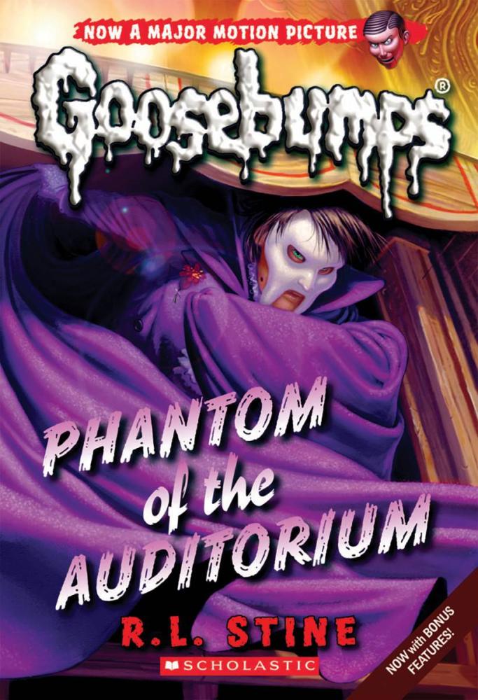
Opinion: This cover feels a bit more cramped, and definitely cropped in comparison to the full art. Good detail on the phantom as he awaits under the stage. If he wasn't a ghost, I'd pity his posture after being all cramped up like that. C+.
VAMPIRE BREATH

Opinion: This is an alright update. Good detail on the face of Count Nightwing with the wafting vampire breath emerging from the coffin. Feels a bit more alive than Tim's take honestly. B+.
STAY OUT OF THE BASEMENT

Opinion: A great redo of the lone Theissen work. I love that there's a bit more life to this cover with the wild vines emerging all around the door. Even little details like the wearing paint on the door itself is a good touch. I prefer the original with how much more scarier the plant hand looked, but this one is as close as you can get to an update. A.
A SHOCKER ON SHOCK STREET

Opinion: Another redo that I actually like. Good robotic detail on the mantis who looks even more deadly than before. I even like the touch of the weird liquid drooling out of its mouth. Good use of colors in the sky, and it continues that ambiguity to the actual story that the original cover provided. Ace work. A-.
LET'S GET INVISIBLE!

Opinion: Another cover I like better than the original. It gives off a much more freakier image to the invisibility than the original cover did, with some better perspective to boot. A fitting update for one of my guilty pleasure books from the original 62. A.
NIGHT OF THE LIVING DUMMY II

Opinion: While I'm happier to not have that bright pink and green eyesore of the original, this cover is kind of forgettable. Though granted, I like that it focuses on a key scene from the book with Slappy's paint spree, and his deranged, almost satisfied face is a nice touch as well. Overall, it's a decent cover. B-.
NIGHT OF THE LIVING DUMMY III

Opinion: An attempt at redoing the original without as many dummies as Tim provided. Regardless, the dummies provided are still pretty creepy, as is Slappy per usual. Good use of lighting and cobwebs to really sell the old attic vibe. Not as memorable as the first, but still a solid update. B+.
THE ABOMINABLE SNOWMAN OF PASADENA

Opinion: Another cover that feels kind of cramped, but isn't that bad either. Again, it's an absolute lie that sells the concept of a rampaging abominable snowman as the real plot to the book instead of magic snowballs, but I do like the design of this snowman over the original. Looking more wild and feral with more detail on the body itself. Still got them nipples though. A-.
THE BLOB THAT ATE EVERYONE

THE GHOST NEXT DOOR

Opinion: I like this cover more than the original honestly. A better sense of creepiness with the ghost hand, while still being ambiguous as to the identity of the ghost. The creepy knocker though does feel like an attempt at trying to make a scary cover and it comes off as a bit silly. Overall, no checkerboards and Converse sneakers is fine by me. B+.
THE HAUNTED CAR

Opinion: I like the look of this version of the car over Tim's honestly. More sleek and monstrous. The cover is also a bit more action packed as well, compared to the more static original. A quality upgrade cover. A-.
ATTACK OF THE GRAVEYARD GHOULS

Opinion: Not rally a fan of this one. Gone are the more gory and frightening zombies of the original cover in favor or more wisp-like creatures. Granted, they still look nice and creepy, but nowhere as good as the original. D.
PLEASE DON'T FEED THE VAMPIRE!

Opinion: More dynamic than the original with Fifi the vampire poodle looking more detailed and deadly than in the original cover. Though I don't plan on reviewing the GYG books due to their choose-your-own-ending style, maybe the covers will get a similar review to this down the line. As for this one, it works great. A-.
THE HEADLESS GHOST

Opinion: What? No really, what? The original cover, while not super scary still had a good sense of ambiance and fright with the ghost holding his head and looking at the reader. This one just has the ghost as some wild and crazy headless guy sliding down the banister. The colors and the old and dead feel of the background saves it, but this idea could have been done better. C-.
THE HAUNTED MASK II

Opinion: Well that's a definite step up from the prior Haunted Mask cover. Another general redo cover, but with more focus on making the old man mask look a lot more sinister with the glowing eyes and darker green skin. Good use of warped perspectives and some great fog. top notch stuff. A.
BRIDE OF THE LIVING DUMMY

Opinion: Gone is the more standard Slappy design used on the prior covers in favor of the movie design that's also been adapted to the Slappyworld line of books. As for the cover, it's a bit more energetic than the original cover with Slappy and Mary-Ellen coming off more chaotic than in the original cover. For a redo, it's serviceable. B.
ATTACK OF THE JACK O'LANTERNS

Opinion: I really love this one. I like that this isn't just a redo of the original cover. And while that is a more iconic image, this one works with a unique visual of a jack o'lantern monster emerging like it was in the middle of a jump scare. It also looks more alien and frightening than the originals which made the creatures more humanoid. Add in some great colors and you have a super solid follow-up. A+.
And that's all 36 covers that have been released so far (might update when/if more get released). My opinion? I actually don't mind these covers at all. I know a lot of people hate them and find them inferior to Tim's work, which I agree on mostly. When the covers just try to emulate the original work, they more often than not fall flat. Though when we get more original takes on the subject matter, it often leads to some fresh pieces of art that come off as super amazing. And even some of the redos do offer unique angles, or updated details that actually make them a bit more alive than even Tim's stuff. And despite a few covers underwhelming, I actually felt there was nothing in any of these covers that felt terrible or were a disservice to Goosebumps itself. The original works will always be what people associate with the franchise, but these still feel like they have that heart that made the franchise so memorable.
Though why the logo now looks like spooge is anyone's guess.
No comments:
Post a Comment